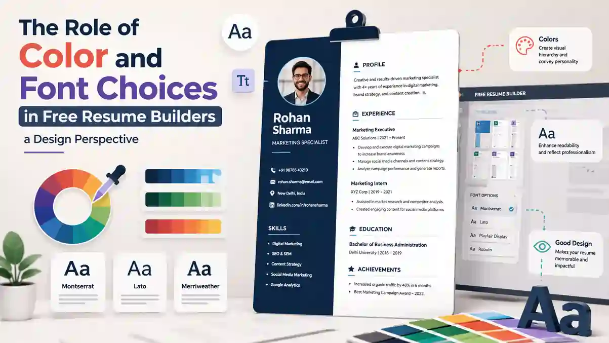
Hiring managers skim fast. When you build your resume with a template, the color and font choices in resume design do more than decorate — they steer attention, improve ATS parsing, and shape first impressions.
Table of Contents
- Why Color and Font Choices Matter
- What These Choices Signal to Reviewers
- Picking Fonts That Work Everywhere
- Readable Sizes and Spacing
- Using Color With Restraint and Purpose
- Layout, Hierarchy, and Scannability
- Common Mistakes That Hurt Readability
- Working Inside a Free Resume Builder
- Quick Setup Checklist
- Frequently Asked Questions
- Conclusion
Free Resume Builder
Don’t let a weak resume decide your future.
Thousands of people are getting rejected — not because they’re bad, but because their resume doesn’t speak for them. Make a resume that actually gets shortlisted.
Your next job is closer than you think.
Start in 2 minutes.
No complicated forms. Just pick a template, fill details, And Apply.
Apply Now Your Job →Why Color and Font Choices in Resume Design Matter
Good design reduces cognitive load. Clear hierarchy, steady spacing, and consistent styling make your skills easier to scan, which means more of your wins get noticed by a recruiter reading dozens of resumes in a single sitting.
Resume color and font choices influence skim speed, comprehension, and how credible your experience feels at a glance. A well-structured resume, similar to the principles covered in our ATS-friendly resume format guide, gives both humans and software a fair shot at understanding your value quickly.
What Color and Font Choices Signal to Reviewers
Consistent headings and restrained color say you're organized and detail-aware. Hard-to-read fonts, low contrast, or chaotic spacing hint at sloppy execution, even when the content itself is solid.
This is why understanding what makes a good resume look good to recruiters is just as important as writing strong bullet points.
Picking Fonts That Work Everywhere
Choose a single, common font family and use weight and size to create hierarchy. Safe picks include Calibri, Arial, Helvetica, Georgia, Cambria, or Source Sans 3. Keep body text at 10.5–12 pt, headings at 13–14 pt, and line spacing near 1.1–1.2 for screen legibility.
The best fonts for resume clarity are those tested across Windows, macOS, and ATS software, so avoid novelty or thin script faces. Many systems read ATS-friendly resume fonts more reliably when they're standard, non-embedded, and not converted to outlines or images.
| Font | Best Use | ATS Safety |
|---|---|---|
| Calibri | Modern, clean body text | Excellent |
| Arial | Universal, neutral tone | Excellent |
| Georgia | Traditional, senior roles | Good |
| Source Sans 3 | Tech and creative roles | Good |
| Cambria | Formal, academic resumes | Good |
Readable Sizes and Spacing
Use consistent margins (0.5–1 inch), 4–8 pt spacing before section headers, and bullet spacing that keeps lines to 45–75 characters. Align dates along the right using tabs — not text boxes — to avoid parsing issues.
These small formatting habits align with the broader smart resume formatting tips that keep a document scannable across devices and printouts.
Using Color With Restraint and Purpose
Color should support, not shout. Stick to one accent color for headings or lines and keep body text near-black (#111–#222). Aim for at least a 4.5:1 contrast ratio for any colored text on white to stay accessible.
A simple, high-contrast resume color scheme — like navy accents with dark gray text — keeps the page calm and readable on both monitors and printouts.
- Navy or charcoal accents tend to look professional across industries.
- Keep hyperlinks legible; if the blue is bright, bold it for contrast.
- If in doubt, print a copy and do the squint test: sections should pop without color.
Layout, Hierarchy, and Scannability
Use one column for ATS reliability. Build hierarchy with weight (bold headings), size steps (13–14 pt vs. 11 pt), and spacing — not with multiple fonts. Keep bullets tight and impact-first: metric, action verb, result.
Simple, consistent resume formatting tips like left alignment, predictable section order, and clear labels help recruiters find what they need in seconds. Good resume typography relies on contrast, rhythm, and restraint: use bold for headings, small caps or letter-spacing for subheads, and regular weight for bullets.
For a deeper structural breakdown, see our overview of resume formats and why single-column layouts consistently outperform two-column designs in ATS parsing.
Common Mistakes That Hurt Readability
- Putting text in images or shapes — ATS can't parse it.
- Overusing color blocks that reduce contrast on small screens.
- Mixing too many font sizes, leading to a wobbly visual rhythm.
- Right-justifying long paragraphs, which creates rivers of white space.
These same issues are covered in more depth in our guide on how to build an ATS-friendly resume that passes the bots.
Working Inside a Free Resume Builder
Start with a clean, single-column template, then edit styles before adding content. Set your font family, sizes, and accent color first so formatting stays consistent as you paste text.
A solid free resume builder should let you adjust heading sizes, line spacing, and export a text-based PDF that preserves real characters. Use template styles to achieve a professional resume design without hacking spacing with manual tabs or extra spaces.
Lean on templates that follow resume design best practices like clear section labels, predictable spacing scales, and sensible margins. If you like a fresher look, aim for a restrained modern resume design with a single accent color, thin divider lines, and compact bullets — the kind offered in India's best free resume builders for 2026.
Color and Font Choices in Resume Design: Quick Setup Checklist
- Font: one family; 11 pt body; 13–14 pt headings; 1.15 line spacing.
- Colors: black/dark gray body; one accent with 4.5:1 contrast on white.
- Structure: single column; real text; no text boxes for main content.
- Bullets: one line when possible; lead with numbers and outcomes.
- Export: PDF (text-based), then reopen to confirm copy/paste works.
Frequently Asked Questions
1. What is the safest font to use on a resume in 2026?
Calibri, Arial, and Source Sans 3 remain the safest picks because they render consistently across Windows, macOS, and most ATS parsers without converting to outlines.
2. How many colors should a resume have?
Stick to two: near-black body text and one accent color for headings or divider lines. More than that reduces contrast and distracts from content.
3. Does font size affect ATS scoring?
Font size itself doesn't affect ATS scoring, but very small text or decorative fonts can cause parsing errors, so 10.5–12 pt body text is recommended.
4. Can I use a two-column layout with different colors per section?
It's better to avoid two-column layouts for ATS reliability. A single column with one accent color parses more consistently across applicant tracking systems.
5. Is it okay to use bright colors like red or orange on a resume?
Bright colors like red or orange are generally not recommended since they lower contrast readability and can appear unprofessional in corporate settings; muted navy or charcoal accents test better with recruiters.
Conclusion
Keep it simple: one font family, one accent color, steady spacing, and content that leads with results. Test contrast, print a copy, and run a quick ATS check by copying text from your PDF.
Ready to build a resume with color and font choices already dialed in?
Try ResumeEra's Free Templates
You’re not failing.
Your resume is.
Most people lose jobs before the interview — not because they lack skills, but because their resume looks average. Fix that in 5 minutes.
- ✅ ATS-optimized format
- ✅ Recruiter-friendly design
- ✅ Download instantly (PDF)
⚡ No signup required • 100% Free • Works on mobile
Get shortlisted faster
Pick a template → fill details → download resume.