Table of Contents
-
Introduction
-
What Makes a Resume Look Good in 2026?
-
Best Resume Fonts
-
Best Resume Layout and Structure
-
Essential Resume Sections
-
Resume Design Mistakes to Avoid
-
ATS-Friendly Resume Guide
-
Best Resume Format for Freshers
-
Best Resume Format for Experienced Professionals
-
One-Page vs Two-Page Resume
-
Resume Color Tips
-
Resume Template Tips
-
PDF vs DOCX Resume
-
Resume Example Breakdown
-
What Recruiters Notice First
-
Comparison Tables
-
FAQs
-
Conclusion
Free Resume Builder
Don’t let a weak resume decide your future.
Thousands of people are getting rejected — not because they’re bad, but because their resume doesn’t speak for them. Make a resume that actually gets shortlisted.
Your next job is closer than you think.
Start in 2 minutes.
No complicated forms. Just pick a template, fill details, And Apply.
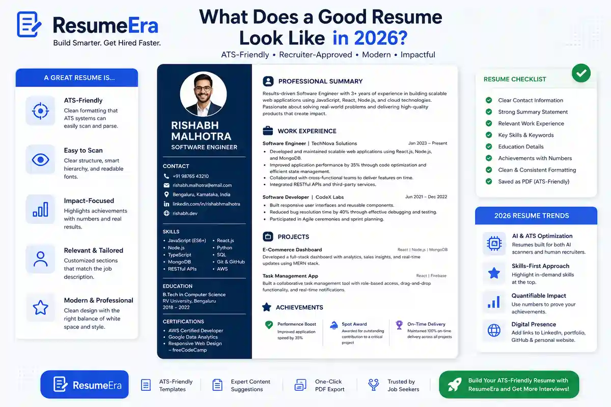
Apply Now Your Job →A good resume is not the prettiest one in the room. It is the one that is easy to read, easy to scan, and easy for ATS software to parse before a recruiter even opens it.
Most resumes fail for the same simple reasons: messy formatting, weak section order, keyword gaps, and design choices that look creative but confuse both recruiters and ATS systems. If your resume does not tell a clear story in a few seconds, it gets skipped.
In 2026, a good resume looks modern, clean, and purposeful. It should show your value fast, use standard structure, and make it easy for hiring teams to see why you fit the role.
What Makes a Resume Look Good in 2026?
A good resume in 2026 is built for two readers at the same time: ATS software and human recruiters. That means the resume must be structured enough for parsing, but readable enough for a quick human scan.
The best resumes are not crowded. They use white space, simple headings, strong verbs, and short bullet points that show results instead of long paragraphs. Recruiters want to understand your background in seconds, not decode a design project.
What makes a resume look good today:
-
Clean one-column layout.
-
Standard section names like Experience, Education, and Skills.
-
Strong keyword match with the job description.
-
Short, achievement-focused bullets.
-
Enough white space to make scanning effortless.
A good resume also feels consistent. Fonts, spacing, and alignment should look intentional across the entire page. That simple consistency builds trust, which is part of EEAT in resume presentation.
Best Resume Fonts
Font choice matters more than many job seekers think. A clean font improves readability, while a decorative or unusual font can make the resume look amateurish or break ATS parsing.
The safest fonts are simple sans-serif or classic serif fonts that are easy to read on screens and in PDFs. Good fonts also help the recruiter skim your document without effort.
Best ATS-safe resume fonts:
-
Calibri.
-
Arial.
-
Helvetica.
-
Verdana.
-
Times New Roman.
-
Georgia.
-
Cambria.
Fonts to avoid:
-
Script fonts.
-
Fancy display fonts.
-
Ultra-thin fonts.
-
Decorative handwritten styles.
-
Any font that looks stylish but hurts clarity.
For most people, Calibri or Arial at 10.5 to 11 pt is the safest choice. If you want a modern but professional look, use one font family consistently and keep the styling simple.
Best Resume Layout and Structure
A good resume layout should guide the reader naturally from top to bottom. The order matters because recruiters usually scan the top first, then move quickly through experience, skills, and education.
The best layout is usually single-column. It gives the ATS a clear reading order and helps recruiters skim without getting lost. Two-column designs may look modern, but they often create parsing issues and visual confusion.
Strong layout rules:
-
Keep margins around 0.5 to 1 inch.
-
Use consistent spacing between sections.
-
Put the most important information near the top.
-
Use clear section hierarchy.
-
Leave enough white space so the page does not feel crowded.
White space is not wasted space. It improves readability and helps your resume look organized and confident. A cluttered page sends the wrong signal, especially when recruiters are reviewing many resumes in a row.
Essential Resume Sections
A good resume has the right sections in the right order. Missing or misplaced sections can weaken the whole document, even if your experience is strong.
The core resume sections are:
-
Contact information.
-
Professional summary or objective.
-
Work experience.
-
Education.
-
Skills.
-
Projects.
-
Certifications.
For freshers, projects and internships may matter more than work history. For experienced professionals, measurable achievements in work experience should lead the page.
A practical section order for most candidates:
-
Contact information.
-
Summary.
-
Work experience or internships.
-
Skills.
-
Education.
-
Certifications or projects.
If you are building your resume on ResumeEra.xyz, these sections are already structured in an ATS-friendly way, which saves time and reduces formatting mistakes.
Resume Design Mistakes to Avoid
Many resumes fail because they try too hard to look different. Recruiters do not reward creativity when it gets in the way of clarity.
Design mistakes to avoid:
-
Using graphics or illustrations.
-
Adding too many colors.
-
Using tables for layout.
-
Putting important text inside icons.
-
Writing dense paragraphs instead of bullets.
-
Choosing hard-to-read fonts.
-
Using text boxes for contact details or skills.
A resume should look professional, not decorated. If a design element does not improve readability, remove it.
Bad design can also break ATS reading order. When that happens, your experience may appear in the wrong place, or worse, disappear from the parsed version entirely. That is why simple beats stylish in most job applications.
ATS-Friendly Resume Guide
An ATS-friendly resume is one that software can scan correctly and convert into readable information for recruiters. The system looks for section headings, keywords, dates, skills, job titles, and job history.
ATS optimization basics:
-
Use standard headings.
-
Keep formatting simple.
-
Match keywords from the job description naturally.
-
Avoid text boxes, images, and heavy tables.
-
Save as a text-based PDF or DOCX when requested.
Keyword optimization should feel natural. Do not stuff the same word fifty times. Instead, mirror the language used in the job post where it makes sense. For example, if the role asks for “project coordination,” use that term in your bullet points if it truly applies.
Good ATS formatting also means clear file naming. Use something simple like:FirstName_LastName_Resume.pdf
For more job seekers, a PDF is usually safe if it is text-based and not scanned as an image. If a company specifically asks for DOCX, follow that instruction.
Best Resume Format for Freshers
Freshers need a resume format that highlights potential, not just experience. Since work history is limited, the layout should focus on education, projects, internships, certifications, and skills.
Best fresher resume structure:
-
Contact information.
-
Short summary or objective.
-
Education.
-
Projects.
-
Internships.
-
Skills.
-
Certifications.
-
Achievements or extracurriculars.
For freshers, one page is usually enough. The goal is to show relevance and learning ability, not to fill space. Strong project bullets and internship details can make a fresher resume look much more substantial.
A freshers resume should also avoid over-design. Fancy colors and columns may look impressive, but they often reduce readability. A clean ATS resume template is much safer and more effective.
Best Resume Format for Experienced Professionals
Experienced professionals need a resume that proves impact quickly. Recruiters want to see career progression, scope, measurable outcomes, and role relevance.
Best experienced resume structure:
-
Contact information.
-
Professional summary.
-
Work experience.
-
Skills.
-
Education.
-
Certifications.
-
Projects or achievements, if relevant.
Reverse-chronological order works best for most professionals because it shows the latest and most relevant experience first. Each role should include outcome-based bullet points, not just task lists.
For senior candidates, the resume should show:
-
Scale of responsibility.
-
Business results.
-
Tools and systems used.
-
Leadership or collaboration scope.
If you have more than one page, that is fine. What matters is clarity. A well-structured two-page resume can be stronger than a crowded one-page version.
One-Page vs Two-Page Resume
There is no universal rule that every resume must be one page. The right length depends on experience level and job relevance.
One page works best for:
-
Freshers.
-
Students.
-
Career starters.
-
Candidates with limited relevant experience.
Two pages work best for:
-
Mid-level professionals.
-
Senior professionals.
-
Candidates with strong relevant experience, multiple roles, or leadership history.
What matters most is density of value. If your resume uses a second page only because of weak spacing or filler content, that hurts your application. If the second page adds meaningful detail, it is a smart choice.
Resume Color Tips
Color should support readability, not fight it. The best resumes use black text with one subtle accent color.
Safe color choices:
-
Navy.
-
Dark teal.
-
Charcoal.
-
Deep blue.
-
Dark gray.
Color tips:
-
Use one accent color only.
-
Keep body text black or near-black.
-
Use color sparingly for headings or small design accents.
-
Avoid neon, bright red, or too many shades.
A good resume should still look professional in grayscale. If the color is removed and the resume becomes unclear, the design is too dependent on decoration.
Resume Template Tips
A good template makes resume writing easier, but it should not control your content. The best template is one that keeps the structure simple and the text readable.
Choose templates that:
-
Use a single column.
-
Have standard section headings.
-
Leave enough space around text.
-
Avoid heavy borders and icons.
-
Are easy to edit without breaking the layout.
Avoid templates that:
-
Use too many graphics.
-
Have sidebars that bury key content.
-
Force small fonts to fit everything.
-
Look great but read poorly.
A template should make your resume clearer, not busier. That is why ATS resume templates are still the safest option for most applicants.
PDF vs DOCX Resume
PDF and DOCX each have use cases, but the best format depends on the application instructions.
PDF advantages:
-
Looks consistent on all devices.
-
Preserves formatting well.
-
Looks polished when sent directly to recruiters.
DOCX advantages:
-
Easier for some portals to parse.
-
Useful when the employer explicitly asks for it.
-
Easier for ATS systems that prefer text-based uploads in some workflows.
Best practice:
-
Use PDF unless the job posting asks for DOCX.
-
Keep both versions ready.
-
Never submit a scanned image PDF.
-
Test the final file by copying a few lines of text from it.
If your PDF is text-based and cleanly exported, ATS systems can usually read it well. The real risk is not PDF itself; it is poor formatting and image-based content.
Resume Example Breakdown
Here is what a good resume example usually does right.
A strong example:
-
Has a clear name and job title at the top.
-
Opens with a short summary that matches the target role.
-
Uses bullet points with action verbs and outcomes.
-
Includes relevant skills near the top.
-
Shows education and certifications cleanly.
-
Keeps layout clean and easy to scan.
A weak example:
-
Starts with long paragraphs.
-
Uses vague duties instead of results.
-
Has confusing section order.
-
Looks crowded or overly designed.
-
Hides the most important details in sidebars or graphics.
Good bullet points usually follow this pattern:
-
Action.
-
Task.
-
Result.
Example:
-
Improved lead tracking process, reducing response delays and helping the team handle more inquiries efficiently.
That is much better than:
-
Responsible for lead tracking and customer response tasks.
The second version lists a duty. The first version shows value.
What Recruiters Notice First
Recruiters do not read resumes like novels. They scan them. The first things they usually notice are job title, experience relevance, skills match, and how easy the resume is to read.
What gets noticed first:
-
Your name and target role.
-
Most recent experience.
-
Keywords relevant to the vacancy.
-
Clear formatting.
-
Whether the resume looks professional at a glance.
Recruiters often spend only a few seconds on the first scan. That means the top third of your resume has to do the heavy lifting. If the top of the page is messy or vague, the rest may never get much attention.
This is why a strong summary and clean structure matter so much. They make the first impression count.
Comparison Tables
Good vs Bad Resume
| Good Resume | Bad Resume |
|---|---|
| Clean and easy to scan | Cluttered and crowded |
| Standard headings | Creative but confusing headings |
| ATS-friendly structure | Tables, icons, and text boxes |
| Achievement-focused bullets | Long responsibility paragraphs |
| One clear font family | Multiple fonts and styles |
| Strong top section | Weak or buried key info |
ATS-Friendly vs Non-ATS Resume
| ATS-Friendly Resume | Non-ATS Resume |
|---|---|
| Single-column layout | Multi-column layout |
| Standard headings | Unusual section names |
| Text-based PDF or DOCX | Image-based PDF |
| Simple formatting | Heavy design elements |
| Keywords used naturally | Keyword stuffing or missing terms |
| Easy to parse | Hard for software to read |
Modern Resume vs Old Resume
| Modern Resume 2026 | Old Resume Style |
|---|---|
| Clean, minimal, recruiter-readable | Decorative and crowded |
| Bullet points with outcomes | Task-heavy paragraphs |
| Keyword-aligned to the role | Generic copy-paste content |
| One or two colors max | Bright, inconsistent colors |
| Built for ATS and humans | Built mainly for visual style |
PDF vs DOCX
| DOCX | |
|---|---|
| Looks consistent | May shift by device |
| Better for direct recruiter sharing | Sometimes preferred by portals |
| Great for polished final version | Easy to edit |
| Must be text-based, not scanned | Better when explicitly requested |
| Best default for most applications | Use when job post asks for it |
10. Conclusion
A good resume in 2026 is not about flashy design. It is about clarity, structure, and ATS compatibility. If your resume is easy for recruiters to scan and easy for software to parse, your chances improve immediately.
The best resumes use standard headings, readable fonts, clean spacing, and a layout that highlights your value fast. Whether you are a fresher, student, or experienced professional, your resume should make the first scan effortless.
If you want a faster way to build a clean, ATS-friendly resume, use a tool that is designed for modern hiring. Start with ResumeEra.xyz and create a resume that looks professional, reads well, and works better in real applications.
Free Resume Builder
Don’t let a weak resume decide your future.
Thousands of people are getting rejected — not because they’re bad, but because their resume doesn’t speak for them. Make a resume that actually gets shortlisted.
Your next job is closer than you think.
Start in 2 minutes.
No complicated forms. Just pick a template, fill details, And Apply.
Apply Now Your Job →Frequently Asked Questions
1. Is one typo enough for rejection?
2. Can ChatGPT proofread resumes?
3. What is the best resume proofreading tool?
4. How many times should I proofread my resume?
5. Should resumes be PDF or DOCX?
Why Trust Resumeera for What Makes a Good Resume Look Good to Recruiters??

written by (Sharukh Khan)
Co-Founder & Career Expert
The insights shared here are based on real ATS screening experience, resume shortlisting patterns, and hands-on work with job seekers.
- ✔ Certified expertise in resume & ATS optimization
- ✔ Practical hiring exposure through active consultancy work
- ✔ Resume strategies tested against real job shortlisting
- ✔ Updated with current hiring and ATS trends
